Rettew Creative Wordmark
![]()
Bobby Rettew’s Actual Handwriting
“Rettew” is more prominent than “Creative” and is always stacked. “Rettew” is always either black or white; black is used on a white background and white is used when the background is transparent on a light colored background.
Integral Symbol (rotated – 270 degrees)
Bobby has a Bachelor of Science in Mathematics and in his sophomore year of college, he drew this symbol so many times it fit naturally into this logo. Also, all his creative work uses mathematic proportions, so he figured why not integrate something into the logo from his mathematics days. The integral symbol is always either black or white and follows the coloring of “Rettew” at all times.
“Creative” is always red and in all caps
Rettew Creative Mark
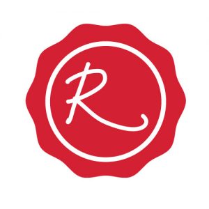
Rettew Creative Mark
The Rettew Creative Mark represents a red, wax stamp used to seal a letter or personal correspondence. This red on white design is comprised of a perfect circle inside the wax stamp surrounding the letter “R” from Bobby Rettew’s signature, the first letter of the Rettew Creative logo.
Social Media
The Rettew Creative Mark is used for all social media icons and avatars representing Rettew Creative. You will find this mark used on the following digital and social media outlets representing the actual Rettew Creative outlets:
Fonts
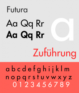
Category: Sans-serif
Classification: Geometric sans-serif
Designers: Paul Renner
– Edwin W. Shaar (Extra Bold, Extra Bold Italic)
– Tommy Thompson (Extra Bold Italic)
Foundry: Bauer Type Foundry
Date Created: 1927
DOWNLOAD: FREE FONTS
Colors

Strong Red
Web cc0033
RGB 204 0 51
CYMK 0 100 75 20

Black
Web 000000
RGB 0 0 0
CYMK 0 0 0 100

White
Web ffffff
RGB 255 255 255
CYMK 0 0 0 0